Visual identity of the third place Le Moulin de Pont Ru
Built in 1780, Le Moulin de Pont Ru is a social, rural and ecological third place in the Vexin region of France. It’s the story of an association committed to building a fairer world. Under this impetus, the old family building has been brought back to life by over five hundred volunteers. They have built a home open to all, a place of welcome and healing. It’s the energy generated by these encounters that gives the place its soul. Their mission? To encourage the transformation of the individual, to help him or her take care of his or her inner self, free of conditioning, and to bring out the best in him or herself. Their personal development sessions and various activities (permaculture, participative workcamps, cooking…) are aimed at abused women, refugee women, children and/or teenagers in difficulty…
ClientMoulin de Pont RuServicesBrandingAnnée2022Linkwww.moulindepontru.com
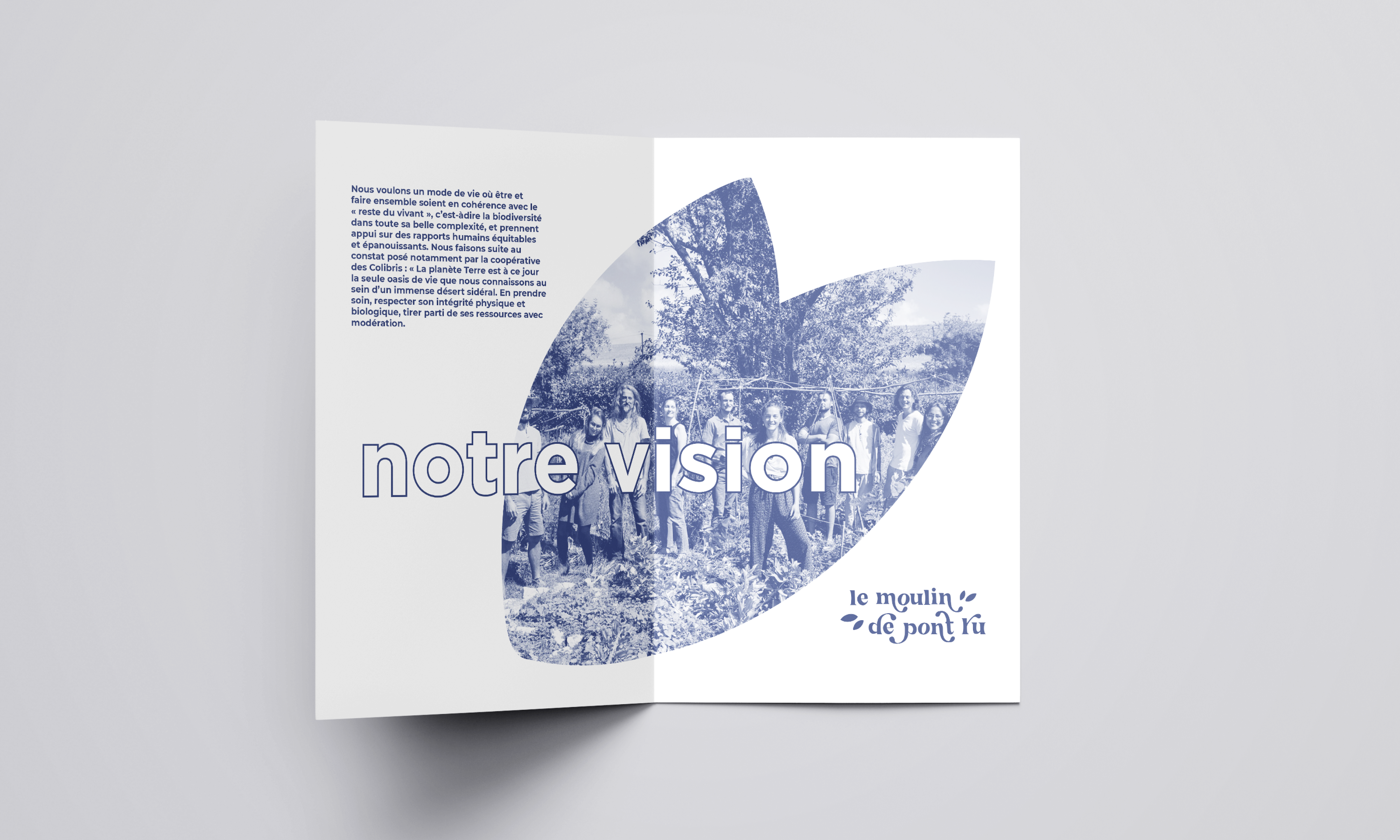
1. A pitch and a brand signature
A pitch that leaves plenty of room for emotion, and tells the essential components of this place in words and story: from the founders’ vision of the world to their vision of third places. From their experience in personal development and social issues, to their motivation for adopting a virtuous lifestyle.
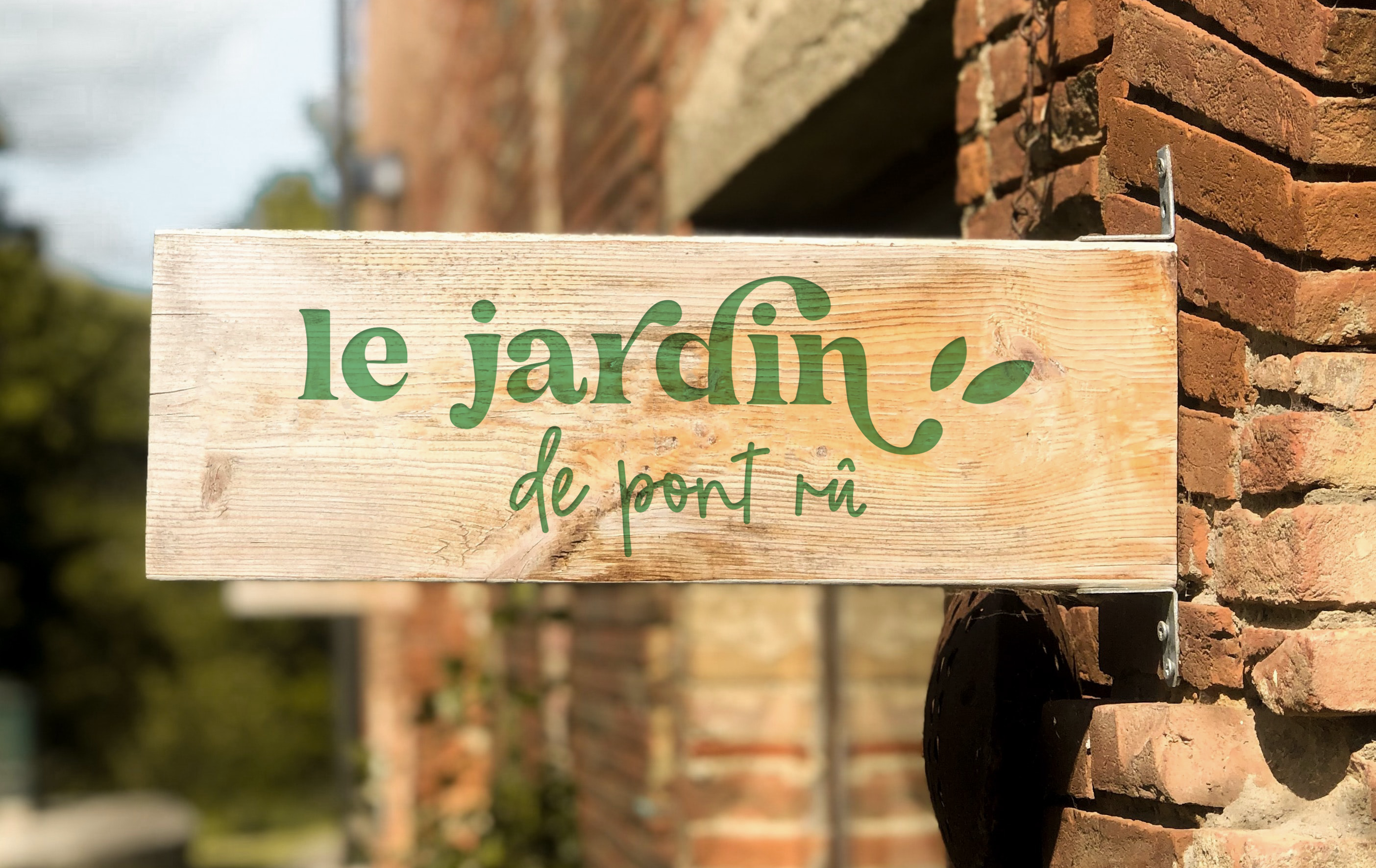
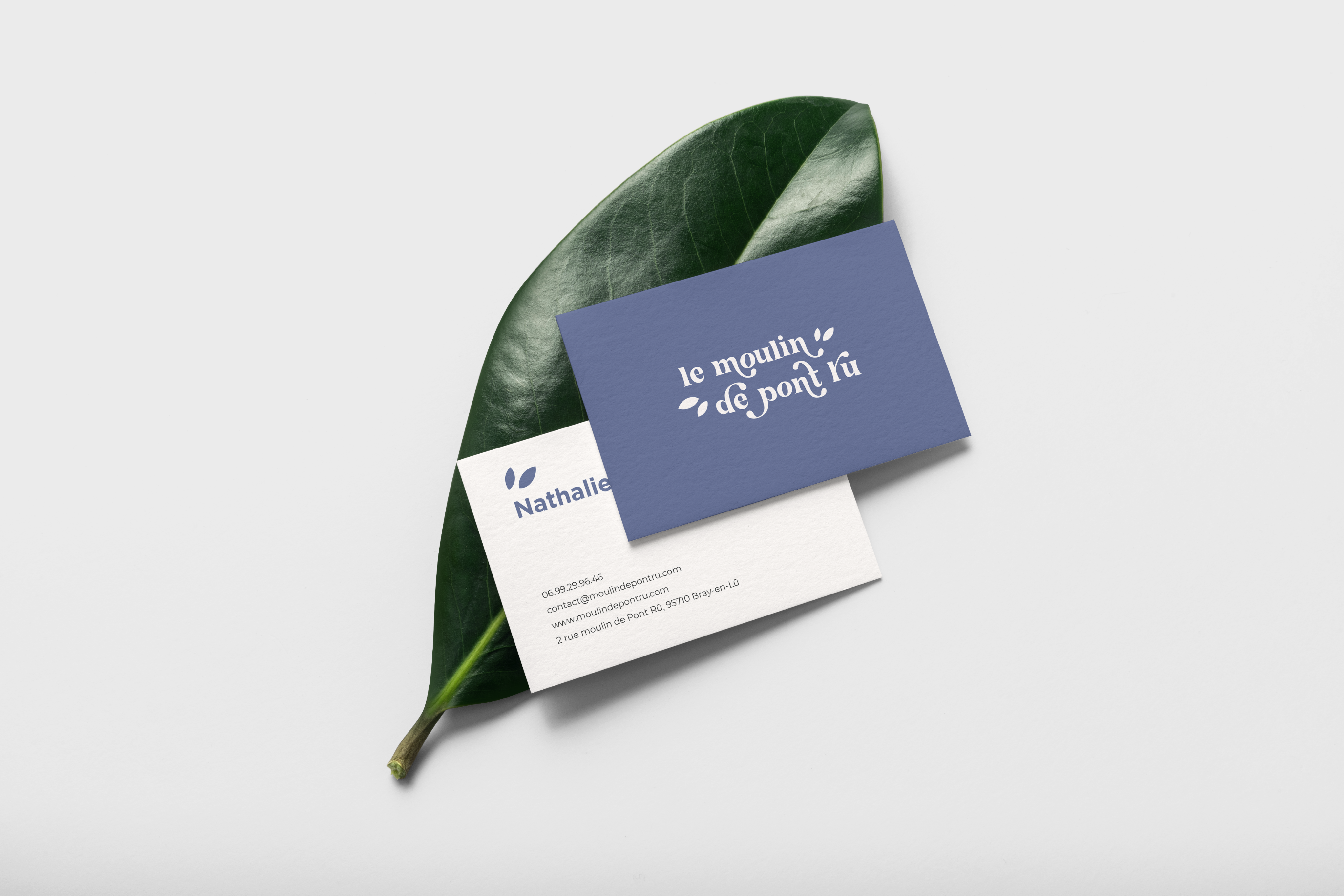
2. Moulin de Pont Ru logo design
With soft, rounded, flowing shapes, this logo creates a harmonious typographic whole, like a dance of letters embracing and cuddling each other. A perfect representation of the soul of the Moulin de Pont Rû.
A visual identity with a very plant-based universe, made up of roots and shoots. The little leaves surrounding the typography are reminiscent of the expression of joy in comic strips. Welcome, support, nature: everything that’s close to the association’s heart can be found here.
Available in the 4 colors of the palette, the logo is versatile, adapting to both corporate and internal use.
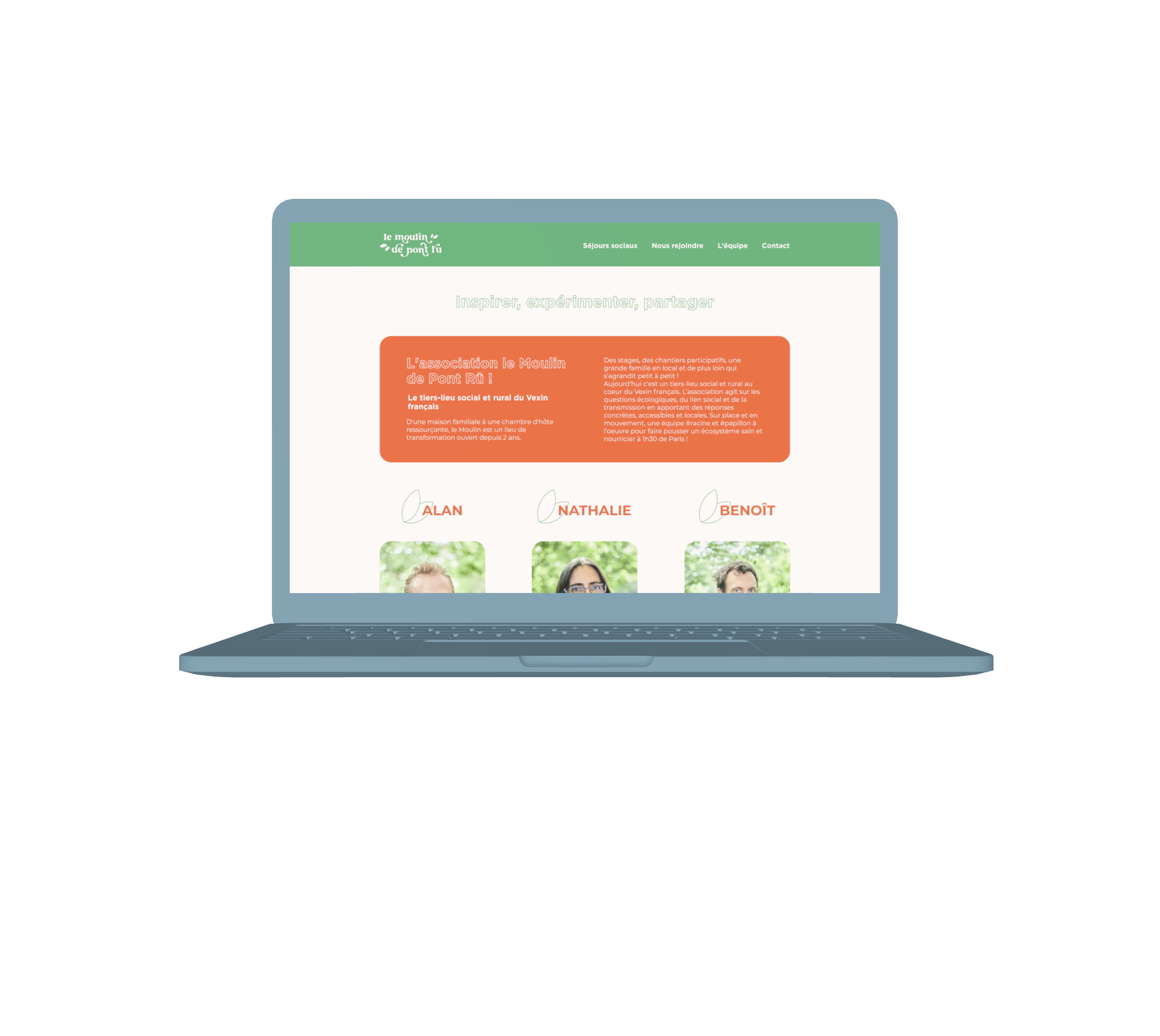
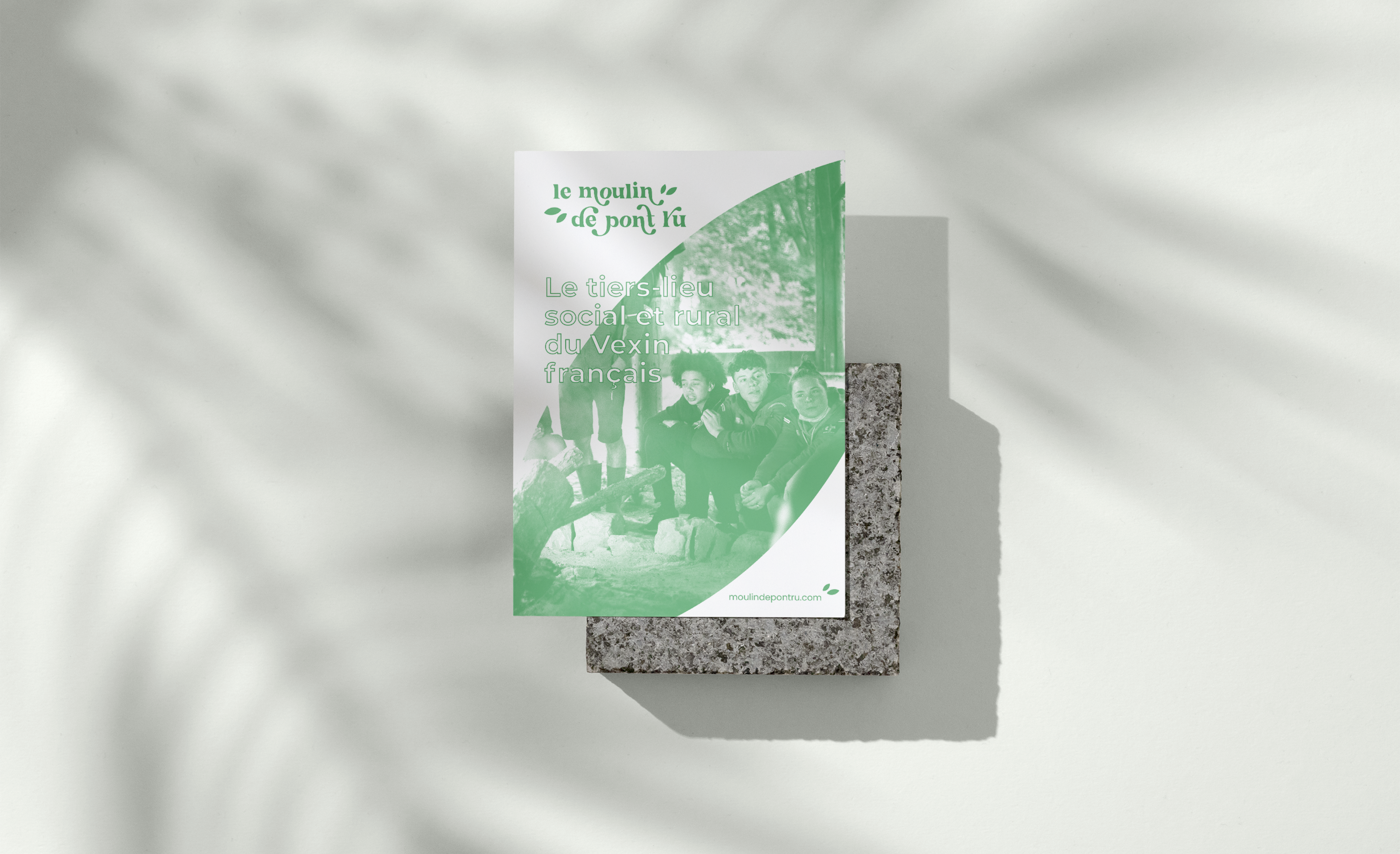
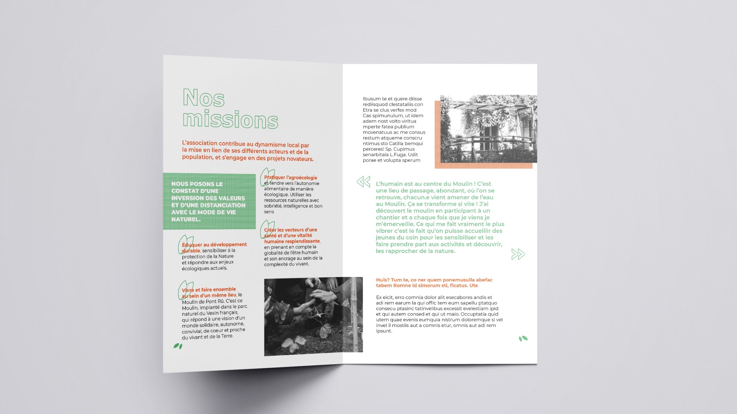
3. A minimalist brand guidelines, an eco-designed brand universe.
A visual identity developed with the aim of limiting inking rates in print,
while remaining consistent in digital. Eco-design principles have been implemented, without sacrificing aesthetics.
– Titles are used in wire-frame, meaning that color is only present on the outline of the letters. The inside of the letters is left pure white, so that no ink is used there.
– Solid graphic elements are replaced by dotted lines, greatly reducing the paper’s inking rate. For example, solid colors under a large block of text, or under an image to highlight it.
– The leaf on the logo is reused as a visual marker, at the bottom of the page for example, to frame the content.
We are extremely proud to support Moulin de Pont Ru, in their Branding strategy
Credits : © Wild&Slow
Brand platform : Julie Michaud & Julien Massiot
Creative direction : Julien Massiot
Signature : Julie Michaud
Logo design : Julien Massiot
Brand guidelines : Ezekiel Vienne
Would you like to discuss your project ?
Agency committed to CSR / Expertise / Education / Creation