Le Pays du Vignoble Nantais : a successful territorial branding
Le Pays du Vignoble Nantais is a Scot-based organisation whose mission is to promote the region’s heritage: to contribute to the knowledge, preservation and transmission of the region’s built, natural and cultural heritage. Its second mission is to define long-term strategies in the field of regional planning: review and management of the Scot and management of a permanent dialogue between its member local authorities to encourage experimentation and innovation, including new methods of public intervention.
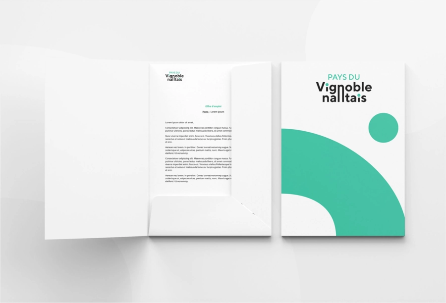
ClientPays du Vignoble NantaisServicesBrandingAnnée2023Linkwww.vignoble-nantais.eu
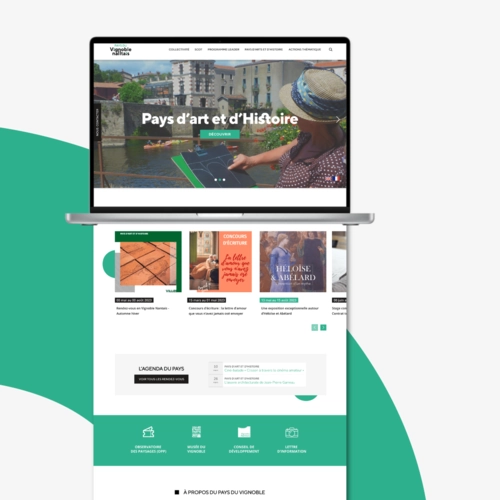
The creation of the visual identity for Le Pays du Vignoble Nantais was a complete territorial branding project, including a brand story, a renaming, a reworking of the visual identity and a brand architecture to structure two sister brands: Le Pays du Vignoble Nantais and Le Musée du Vignoble Nantais.
This case study highlights the efforts made to create a strong, coherent identity that highlights the assets and history of this wine-growing region. The branding agency played a key role in the realisation of this project, working closely with local stakeholders.
Story and name
One of the key aspects of the territorial branding project for Le Pays du Vignoble Nantais was structuring the narrative and optimising the naming. Following in-depth research and workshops on the brand’s DNA, the agency proposed names that were faithful to the structure, with a real ambition to simplify the official name (Syndicat Mixte du Scot et de Pays du Vignoble Nantais). The agency also put in place a brand compass: origin, vision, ambition, values, mission, relationship, promise.
Visual identity redesign
Redesigning the visual identity of Le Pays du Vignoble Nantais was an exciting creative process. The aim was to create a modern and attractive design that would reflect the essence of the region. We worked on creating a distinctive logo and a colour palette inspired by the surrounding wine-growing landscapes.
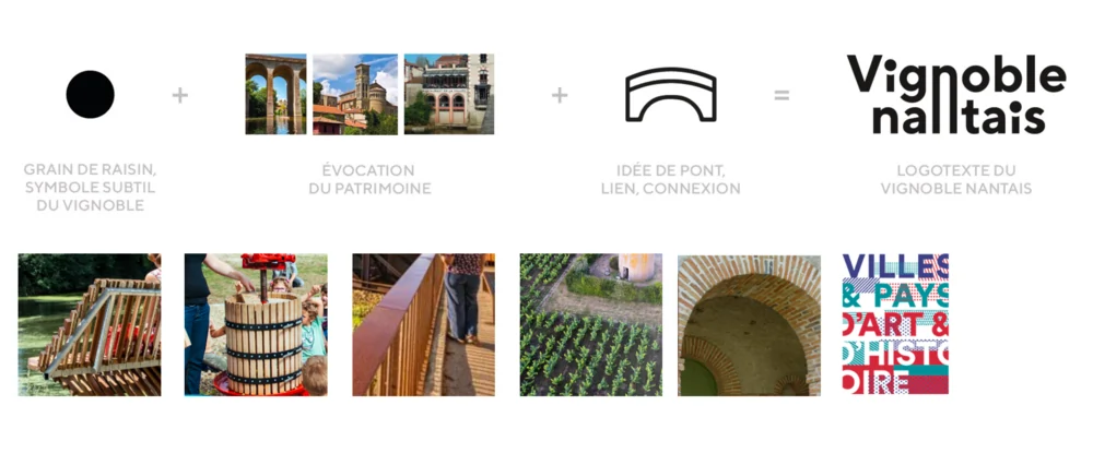
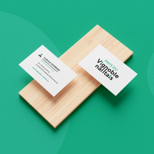
The logo is very much inspired by the built heritage as much as by the clean lines of the vines, while symbolising the idea of bridges and connections so dear to this collaborative structure.
Key concepts
Dialogue
Life and dynamism
Architecture
Landscapes
History
Lines
Brand architecture
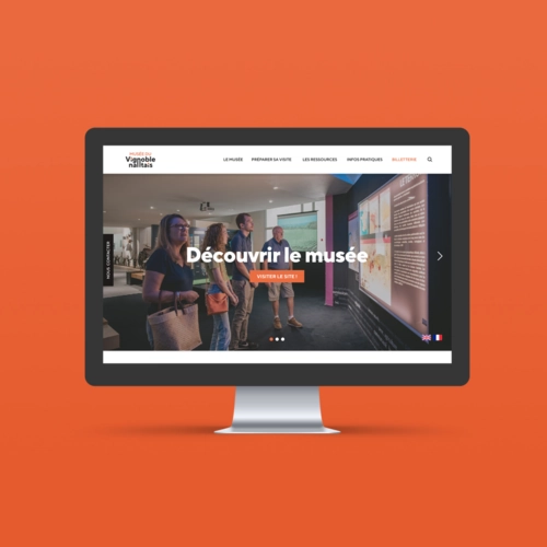
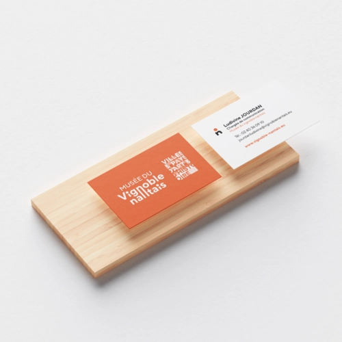
We also developed a solid brand architecture for Le Pays du Vignoble Nantais and Le Musée du Vignoble Nantais, two sister brands. The aim was to create visual and narrative coherence between these two entities, while enabling them to stand out from the crowd. To achieve this, the agency worked on a complementary branding approach. Le Pays du Vignoble Nantais logo is used as the main element, while Le Musée du Vignoble Nantais logo incorporates a marginal evolution: colour and first word. This allows the two brands to share a common identity while retaining their own personality.
Finally, we have started work on a brand guide and have adapted all the communication media for Le Musée du Vignoble Nantais and Le Pays du Vignoble Nantais.
Conclusion
The creation of the visual identity for Le Pays du Vignoble Nantais was a successful territorial branding project, thanks to our agency’s expertise in the field. Renaming, redesigning the visual identity and brand architecture helped to create a strong, coherent identity for the region and Le Musée du Vignoble Nantais. This case study highlights the creative approach and teamwork that went into this territorial branding project. To find out more about the branding agency’s services, visit our page.
Would you like to discuss your project?
Committed agency / Expertise / Education / Creation