Branding and international brand platform for Catenda
Catenda is a major international player in Open BIM, democratising the use of open standards data by the AEPDO (Architecture, Engineering, Promotion, Development and Operations) industry, from design to maintenance. Founded in Norway in 2009, Catenda is first and foremost an international company and a blend of cultures, with offices throughout Europe, the United States and Asia.
ClientCatendaServicesBrandingAnnée2023Linkcatenda.com
With a shared passion for information technology, large buildings and human interaction, Catenda was created with the belief that the use of open international standards and new technologies would contribute to the sustainable development of the global construction and infrastructure industry.
After 13 years of existence and several stages of evolution, including a brand speech in 2018, it was clear to Catenda that their international dimension had profoundly changed the company’s positioning, even if the original vision was still very much present. Wild&Slow was therefore asked to lead a pool of stakeholders of 8 different nationalities, in order to put in place a branding strategy that was faithful to the brand’s DNA and to the current issues facing its target audiences.
Brand platform: embodying Catenda's personality in substance.
It’s not just a question of redesigning a logo, but of determining what makes a brand in terms of personality, values and a unique proposition for its customers.
When it comes to writing a brand platform, there’s one thing we can’t do without at Wild&Slow: our 2 collaborative workshops, ‘The brand in its market’ and ‘The soul of the brand’, which enable us to draw on a wealth of emotional raw material by confronting the various contributors with their market and the essentials of their brand. In particular, this type of workshop enables us to pinpoint points of tension, areas of disagreement and subtleties that would never come to light without these workshops. It also has a strategic objective, as it helps to unite employees around a common, formalised culture.
Given the diversity of our locations, we developed a tailor-made approach to ensure that our workshops ran smoothly remotely, using the Klaxoon tool in particular.
Our deliverable: a brand platform complete with an emotional market report, a brand compass, a golden circle, a Chinese portrait, and above all the pitch (story-telling) and signature (or slogan).
For Catenda, the challenge was to highlight the depth of their vision, in a construction and software market where, on the one hand, people don’t dare say things with commitment, and where all the players remain very cold and technical in their approach. For example, while climate change is a major issue, it appears to be absent or superficial in all the brands analysed.
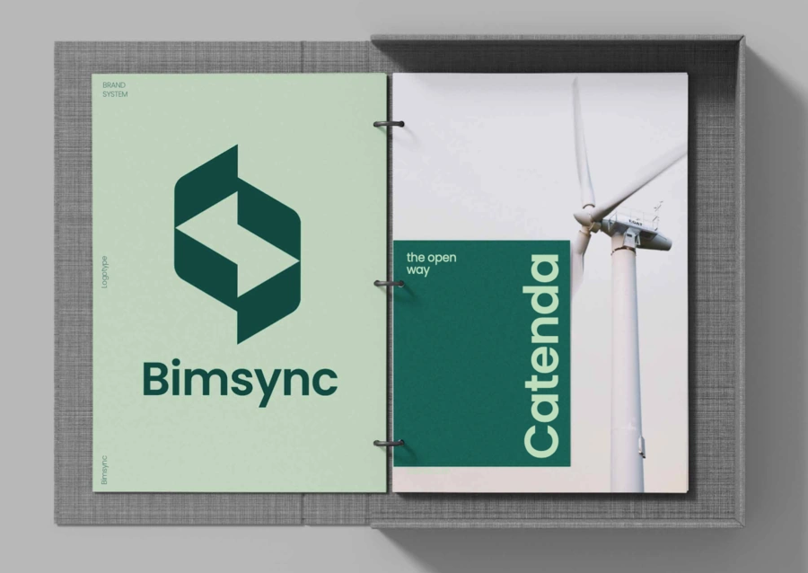
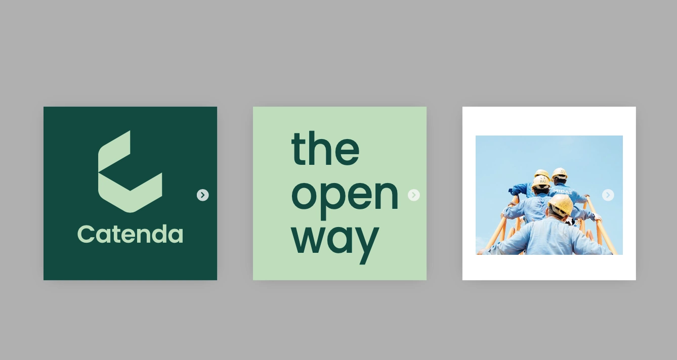
Catenda, The open Way
The driving force that emerged during our workshops was an element of culture, a strong value: openness.
“The moment that made the biggest impression on me was when Julien read us the speech. I think I could still have tears in my eyes, it was so powerful… There was a message that suited us so well, I think it’s the best memory of this collaboration. And it also marks the end of our first work together, and as that’s exactly the emotion we wanted to convey, I think this collaboration is a no-brainer.” Eva Stepak-Heritier, marketing director of Catenda.
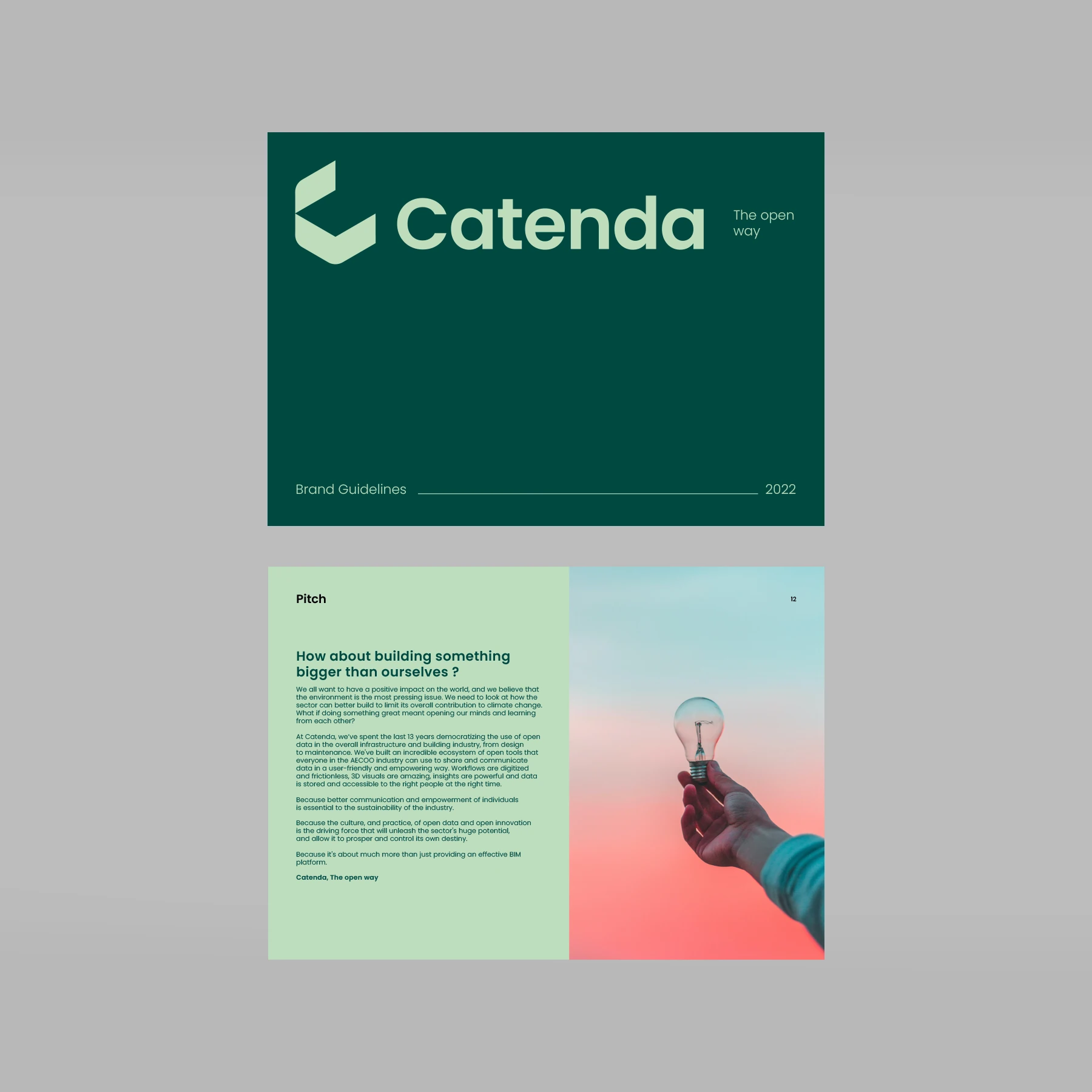
This new brand pitch was based on a new tagline: The Open Way.
Explanation:
– It’s a journey, a process.
– A way is an attitude, the way things are done, a value.
– It’s the way you work.
– It is the alternative, the word of the challenger bringing a new way to see things.
– It raises emotion in this sector.
– We are open from design to maintenance.
– We are open in our culture.
– The data is open

Design: an overhaul to boost emotional power
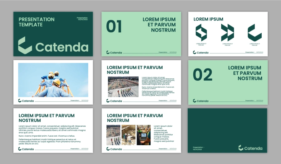

Concept
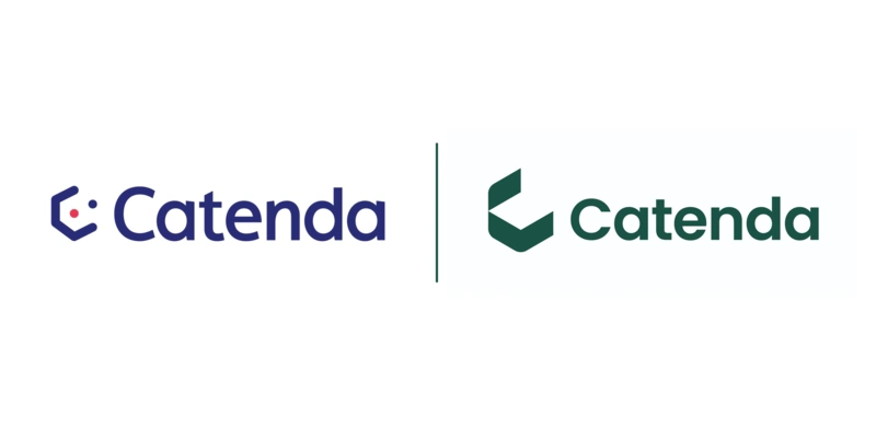
C for Catenda. The name Catenda has a remarkable sound, and is one of the brand’s strong points. It’s also a clear link with Catenda’s existing identity.
A 3D approach. The design of the C is in 3D, and the eye can see it in several different ways. It’s a real pleasure to discover the different perspectives.
An open C. The logo is arranged in such a way as to emphasise openness to the world. It’s a shape with 4 doors, one of which is open.
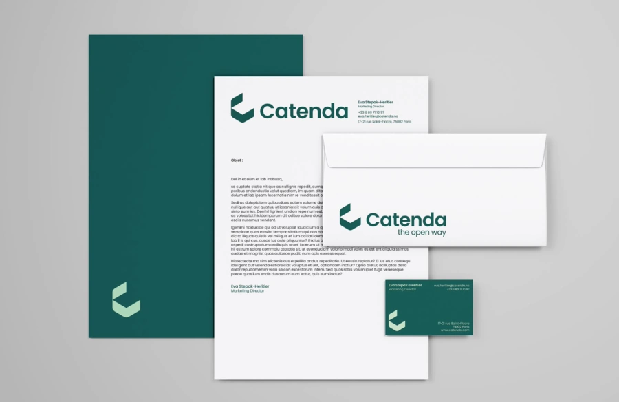
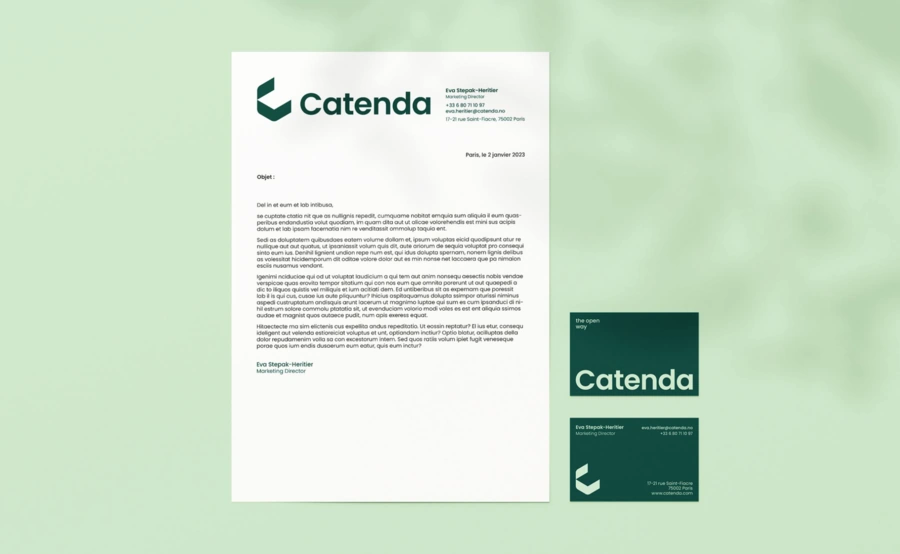
Colours
We’re using a deep green that clearly stands out from the usual codes of the BIM Software world, which are considered to be very cold and impersonal. Deep green is a link to nature, while light green is fresh and modern. The result is a subtle, premium and modern two-tone colour scheme.
Iconography
In order to illustrate the human dimension of a tool whose main aim is to get people to work better together, we have rebalanced things: gone is the bias towards views of buildings, in favour of images of diverse and varied human beings thinking together. In addition, AEPDO is a very broad sector, involving not just the construction of buildings, but a wealth of infrastructures, with professions ranging from design to the deconstruction of buildings.
Becoming an international benchmark
Catenda’s ambition is to become an international benchmark. The company’s actions and missions need to be showcased, sublimated, with tools that convey all the passion that drives the company. After this experience in international branding, our collaboration with Catenda continues: sourcing visuals for their website, and building new tools in the future.
Would you like to discuss your project?
Committed agency / Expertise / Education / Creation