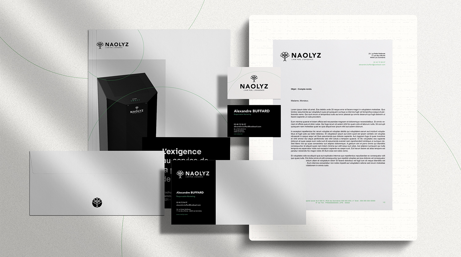
Creation of the Naolyz brand: naming, logo, visual identity
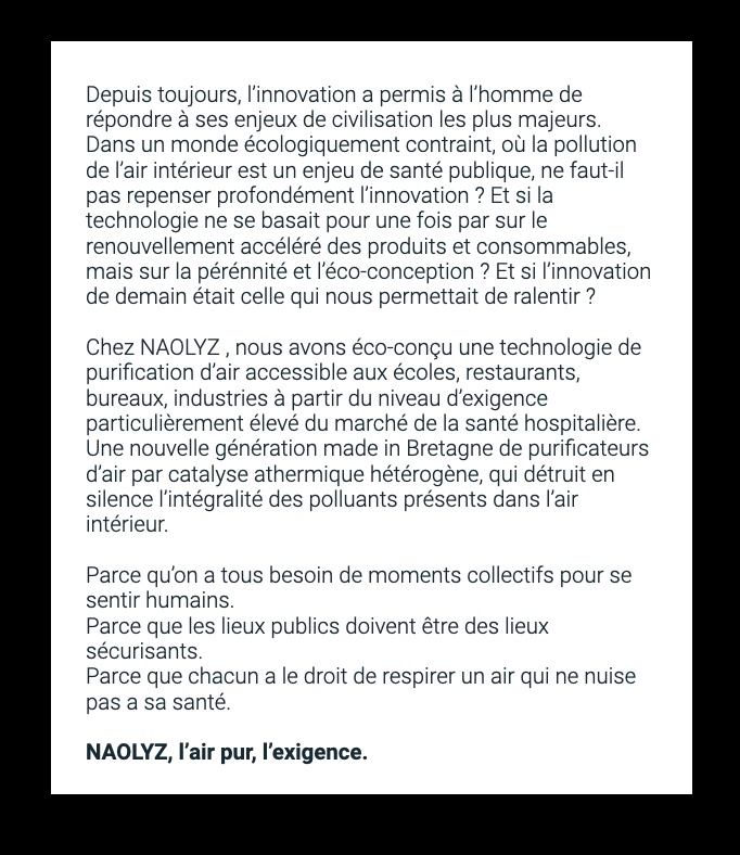
Naolyz is a manufacturer of air purifiers that has developed an innovative technology: advanced evolutionary oxidation. In a market essentially made up of machines that capture pollutants without destroying them, Naolyz has developed a truly disruptive innovation that uses a light source to activate the oxidizing properties of two semiconductor amalgams, acting on the molecules and decontaminating the air.
This project is also a Green Tech project: eco-designed and produced on the Granit Rose coast in Brittany, these purifiers are manufactured with an eye to environmental optimization at every stage of the life cycle. In short, a premium and demanding Made in France.
ClientNaolyzServicesBrandingAnnée2021Linknaolyz.fr
It was against this backdrop that we stepped in to imagine the entire brand platform and branding. It was against this backdrop that we stepped in to imagine the entire brand platform and branding. Naming, logo, visual identity, 3D products, editorial design… the idea was to put in place a solid brand for an ambitious launch in 2022.
1. Brand naming
Naolyz was conceived as a brand with a short, imaginary and polysemous name.
It tells of the richness of a dual geographical origin (the Nantes region and Brittany) with its prefix Nao (found in Naoned in Breton, Nantes). The slight Vietnamese consonance of Nao is no stranger to the dual nationality of one of the founders. And then there’s LYZ, like this widely-used Breton first name.
2. A pitch and a brand signature
A pitch that leaves plenty of room for emotion, and tells the essential components of this brand in words and story: from the founders’ vision of the world to their vision of innovation. From their 10 years’ experience in the purifier market, to their motivation to revolutionize the sector against programmed obsolescence and Made in China.
3. Creating the Naolyz logo
The starting point for the logo is a universal symbol: the tree. It’s the vegetal element that perfectly represents what the purifier does: it creates pure air, absorbs impurities and fills our lungs with oxygen. The interpretation, the shape of the tree as a criss-cross of air bubbles, is unique, concentrating everything that makes up the evocative universe and healthy dynamics of the NAOLYZ brand.
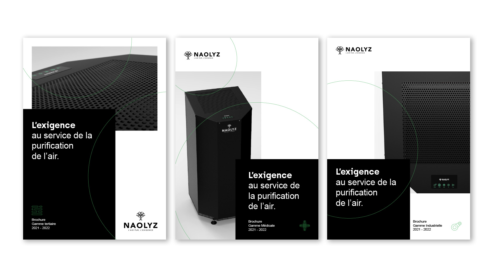
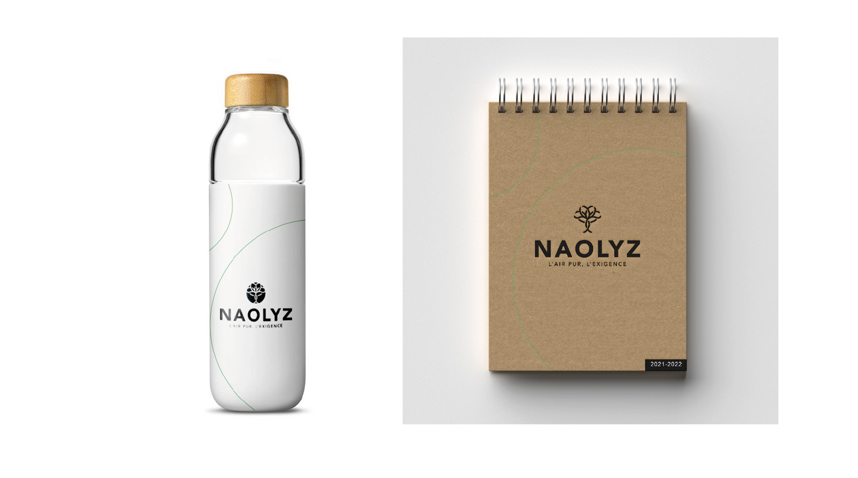
4. A minimalist brand guidelines, an eco-designed brand universe.
NAOLYZ wanted to take things to the extreme, asking us to take a minimalist approach to the design of the brand guidelines. In other words, eco-design.
Here are the rules we set ourselves:
– We defined a chromatic universe composed of 3 colors. All have a low inking rate, with a maximum rate of 150% out of a potential 400%. We give a strong place to black on the Web, to limit energy consumption, and a strong place to white on print to limit printing areas.
– A collection of 2 typefaces. One is “creative”, Archia, the other is old-fashioned and classic, Arial. The latter is used on more than 99% of Windows installations and 97% of iOS installations, which means we can lighten the code in digital since there’s no need to call up external typefaces.
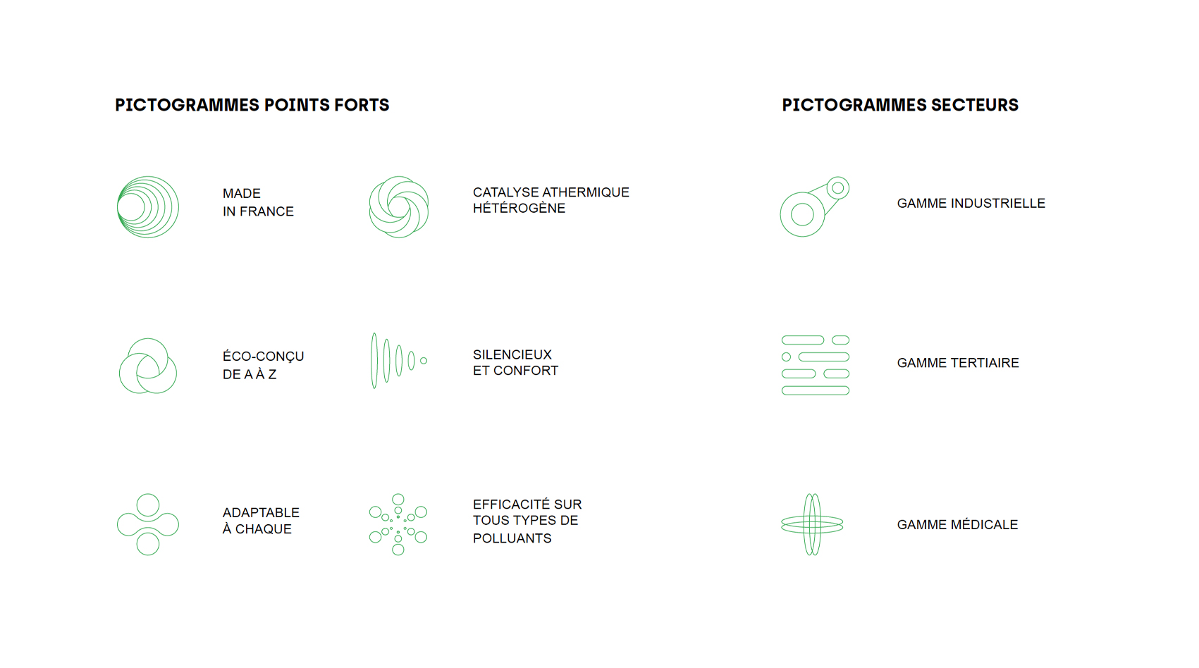
– A collection of pictograms with extremely fine lines
– A collection of brochures with white space
– An eco-designed pre-launch landing page, rated B on the Ecoindex.
We are extremely proud to support the Naolyz brand.
Also worth a look : the Naolyz eco-designed website
Coming soon : the implementation of the 2022 communication strategy.
Credits :
Creative Direction, Copywriting, Signature, Steering : Julien Massiot.
Naming : Team Wild&Slow
Logo design : Yoann Langonné.
Would you like to discuss your project ?
Agency committed to CSR / Expertise / Education / Creation